As you work through the steps in this lesson, you'll use the following skills: adding data to a map, choosing a different basemap, changing the style of the data symbols, customizing the information that appears in pop-ups, saving the map, and sharing the map with your organization.
This lesson is designed for anyone new to ArcGIS Enterprise, GIS, or web mapping. The ArcGIS Enterprise account you use to complete this lesson must be a member of a role with privileges to create, publish, and share content. You must use Map Viewer to complete this lesson. The estimated time to complete this lesson is 20 minutes.
For the purpose of this lesson, you're an investigative reporter assigned to write about general acute care hospitals in Clark County, Nevada. It's up to you to find an interesting story. You've asked your intern to collect some basic data—where the hospitals are located, how many patients they see each year, and what they charge. From there, you'll see if anything interesting emerges that you can explore further. Your intern gives you a comma-separated values (.csv) file of the data and recommends that you use your organization's Enterprise portal. She says you can add the data to a map, quickly see patterns, and make adjustments to better highlight the information. You can then save your work and share it with others.
Download data
Download the .csv file containing information your intern collected about acute care hospitals in Clark County, Nevada.
- Download and open the Clark County Hospitals .csv file.
You see a table with columns of longitude, latitude, cases, name, and other attributes. It’s hard to visualize where these hospitals are located or any patterns in the information. Making a map is a better way to understand your data than viewing it as a table, so that’s your next task.
- Close the .csv file.
Create a hosted feature layer
Add the .csv file to your ArcGIS Enterprise portal and publish it as a hosted feature layer.
- Verify that you are signed in and that you have privileges to create content and publish hosted feature layers.
- Open Content > My Content, click New item, and click Your device.

- Find the file on your device or a machine on your network.
- Choose Add <file name> and create a hosted feature layer or table.
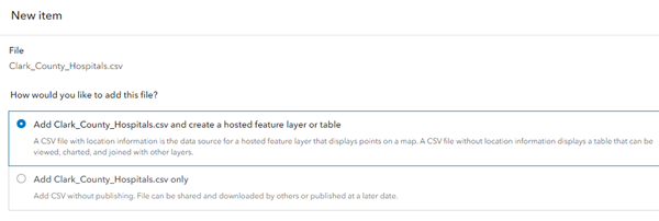
- Click Next.
- Review the included fields and click Next.
- Review the location settings and fields and click Next.
- Type a title.
- Optionally, type tag terms separated by commas.
Tags are words or short phrases that describe your item and help people find your item when searching. Federal land is considered one tag, while Federal,land is considered two tags.
- Click Save.
Add a data layer to a new map and start visualizing patterns
Layers are the way geographic data is organized and combined to create maps. These layers are also the basis for geographic analysis. Seeing location-based information on a map is the foundation of understanding and making decisions. Add the hosted feature layer you created in the previous section to a new map.
- Ensure you are signed in to the ArcGIS Enterprise organization to which you published the feature layer.
- At the top of the website, click Map.
Note:
Depending on your organizational and user settings, you may have opened Map Viewer Classic. ArcGIS Enterprise offers two map viewers—Map Viewer and Map Viewer Classic—for viewing, using, and creating maps.
This lesson uses Map Viewer.
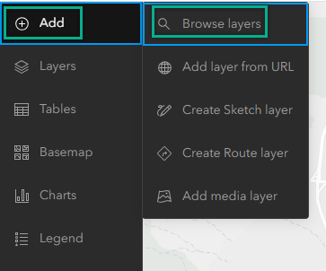
- On the Contents (dark) toolbar, click Add
 and click Browse layers
  .
. 
- Choose My content and find the hosted feature layer.
- Click Add on the item results page to add the layer to the map.
The new layer appears on the map.
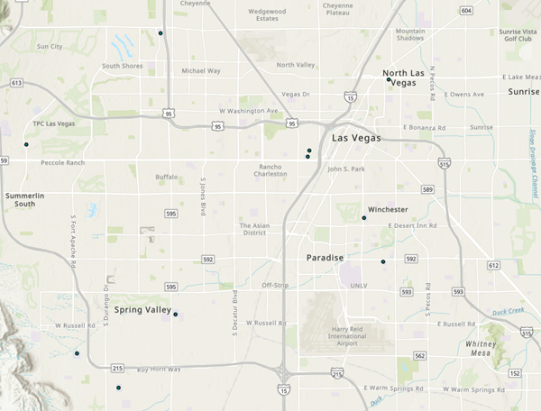
The map displays the locations of the hospitals listed in the .csv file. Each hospital is considered a feature in the layer. You also have access to the descriptive information, or attributes of the data, by viewing pop-ups for features on the map.
- On the map, click any circle.
A pop-up window appears with information about the hospital from the layer's table.
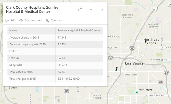
- Close the pop-up.
Change the basemap and layer style
The default basemap is better suited for a reference map than a thematic map. Change the basemap to something simpler.
- On the Contents (dark) toolbar, click Basemap.
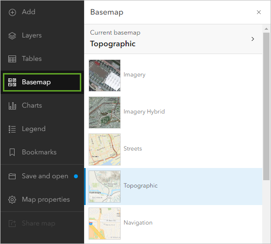
The Basemap pane appears. The Topographic basemap is selected.
- In the Basemap pane, click Light Gray Canvas.
Note:
You may see different basemaps depending on the configuration of your organization. If the Light Gray Canvas basemap is not available, skip to the next step.
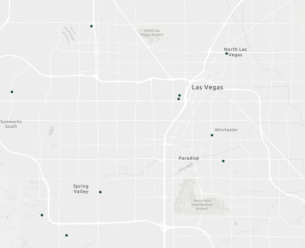
Next, you'll configure the map's symbols so they are sized based on the number of cases at each hospital.
- On the Settings (light) toolbar, click Styles.
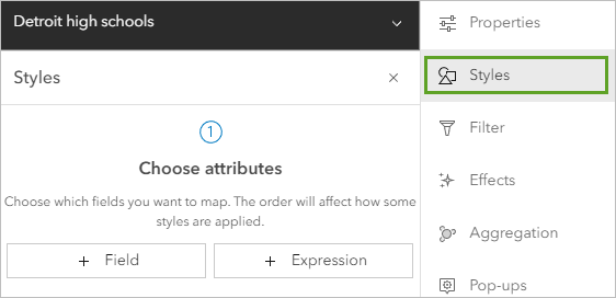
Note:
If the Settings toolbar is unavailable, click Layers on the Contents toolbar and click the hospitals layer to select it.
The Styles pane appears. Currently, the style is based only on the data's location. You'll configure the symbols to convey both location and one of the data's attributes.
- In the Styles pane, click Field. In the Add fields menu, choose Total cases in 2015 and click Add.
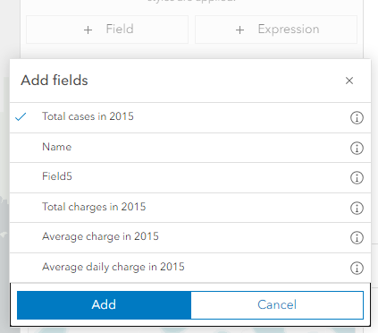
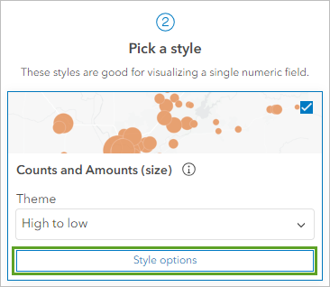
The options under Pick a style update to reflect choices that are suitable for the Total cases in 2015 field. Counts and Amounts (size) is selected and the map updates to reflect this style. This style reveals some new patterns in the data. The larger the circle, the more patients that hospital admitted in 2015.
- On the Counts and Amounts (size) card, click Style options.
- In the Counts and Amounts (size) pane, click Symbol style.
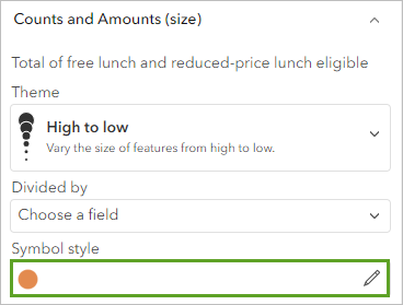
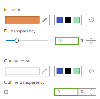
The Symbol style window appears. You'll adjust the symbol's properties so circles can be seen even when overlapping.
- Set Fill transparency to 25 and Outline transparency to 0.
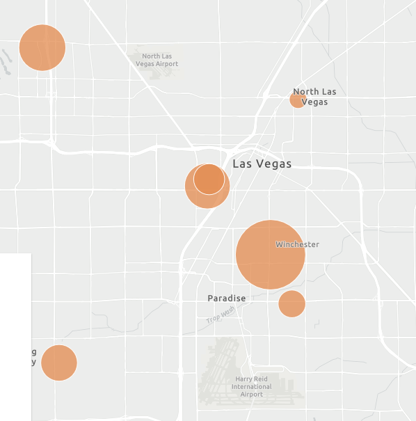
The symbols on the map update. It is now easier to see overlapping circles.
- Click Fill color. In the Select color window, type 0070FF for the Hex value.
The color of the map symbols changes to blue.
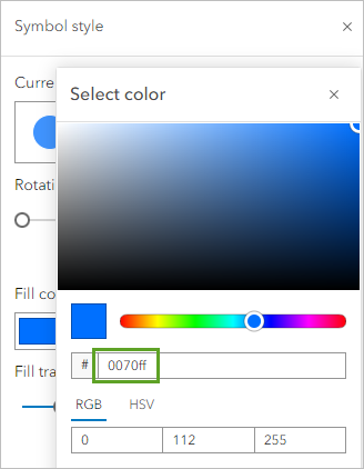
- Click Done three times: on the Select color window, the Counts and Amounts (size) pane, and the Styles pane.
Configure pop-ups and view a table
The pop-up you viewed earlier displayed all the attributes for the features, which may be unnecessary for your map. You can configure pop-ups to only show attributes important to your map. In this example, you only want to show the hospital name and the number of total cases.
- On the Settings (light) toolbar, click Pop-ups.
The Pop-ups pane appears and a sample pop-up appears on the map. The pop-up's title contains the name of the layer and the name of the hospital.
- In the Pop-ups pane, click Title and erase the text in the box.
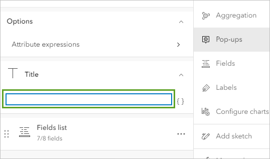
The title text disappears from the sample pop-up. You'll replace the list of fields with a sentence that includes the relevant information.
- Next to Fields list, click the Options button and click Delete.
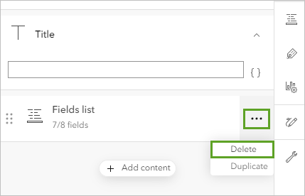
- Click Add content and click Text.
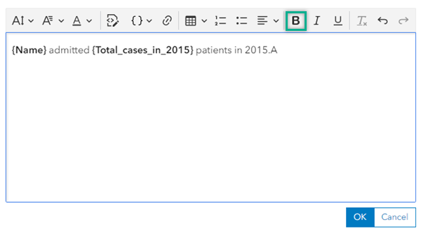
- In the text editing window, type {. In the menu that appears, click Name.
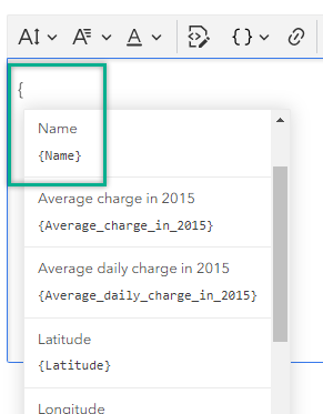
- After {Name}, type admitted {Total_cases_in_2015} patients in 2015.
You can add fields by typing their names inside curly brackets or by choosing them from the list that appears when you type a curly bracket.
- Use the Bold button on the toolbar to add bold formatting to {Name} and {Total_cases_in_2015}.
- Click OK.
The sample pop-up replaces the field names with the attribute values for the selected feature.

All the fields are still in the data table but don't appear in the pop-up. You can modify the contents of the pop-up at any time. You can still see all the attributes by showing the table.
- Close the Pop-ups pane.
- In the Layers pane, click the Options button next to hospitals layer and click Show table.
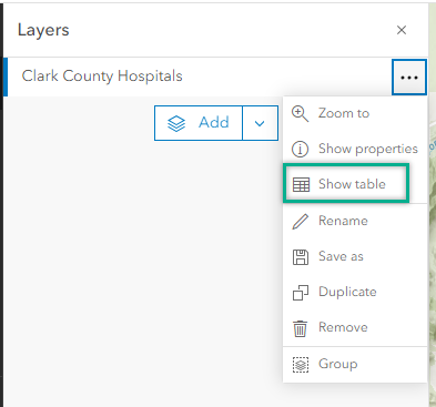
The layer's table appears below the map.
- Review the data in the table. Close the table when you are finished.
Save the map and update the item details
Your map now tells a story about the location and size of hospitals in Clark County. For example, the hospital with the most extensive caseload in 2015 is located in Winchester, an unincorporated township that contains the Las Vegas strip. The hospital with the smallest caseload is about 26 miles away in Boulder City. You assume these size differences reflect relative population density in those places, but you'll want to add some demographic data to your map to verify that theory. For now, you'll save your map so you can share it with your editor when you present your story.
- On the Contents (dark) toolbar, click Save and open and click Save as.
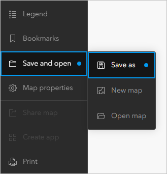
The Save map window appears.
- In the Title text box, type Hospitals in Clark County, Nevada
- Click Save.
By saving your map, you also created a corresponding item page that contains information, actions, options, and settings for the map.
- On the Contents toolbar, click Map properties. In the Map properties pane, click Item details.
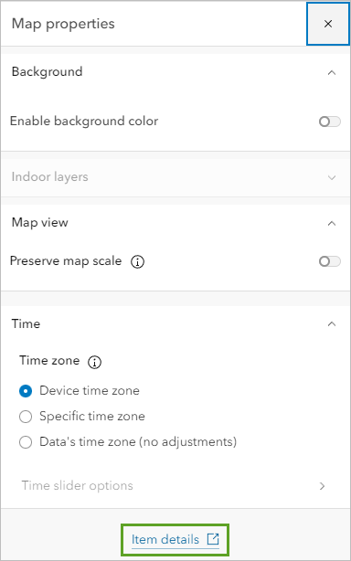
Your map's item page opens in a new window. The item details are missing important attribution and descriptive information that you should fill in before you share the map. For example, you should give credit to the data providers.
- Scroll to the bottom of the page. Next to Credits (Attribution), click Edit.
- Type Nevada Department of Health and Human Services, Center for Health Information Analysis (CHIA) and click Save.
- Close the item page.
Share the map
Eventually, you'll want to share the map with your editor as part of your presentation, but it's not yet ready. You need to do some more work on it until a newsworthy story emerges. In the meantime, you want to share the map with your intern and one of your colleagues so that they can see what you've done so far and provide feedback on what to explore next.
The fastest way to share a map is to share it with everyone and send an email that includes a link to your map.
- In Map Viewer, click Share map
 on the Contents (dark) toolbar.
 - In the Share window, choose Everyone (public) and click Save.
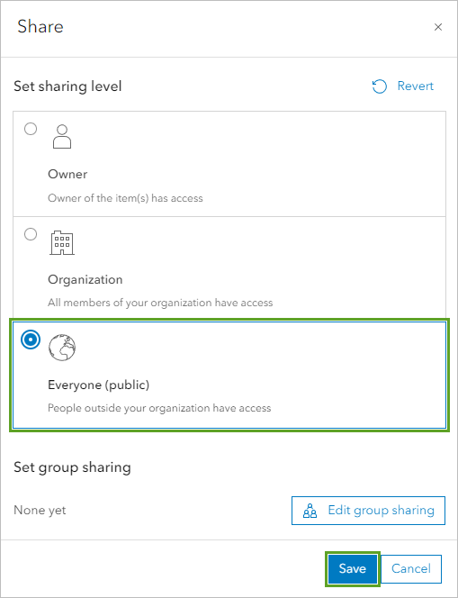
The Review sharing window appears. You must set the sharing level for the layer as well as the map.
- In the Review sharing window, click Update sharing.
- Open the map's item page again and copy the item URL.
In the future, you can also embed the map on your newspaper's website and create a web app that includes a story with additional text, videos, images, and web pages to enhance your map.
Next steps
Your intern was right. In less than 20 minutes, you created a map in your portal and have ideas to share and explore for your story about hospitals in Clark County. What’s next?
To find more scenario-based lessons, browse Learn ArcGIS. You can also visit The ArcGIS Book and The ArcGIS Imagery Book websites.