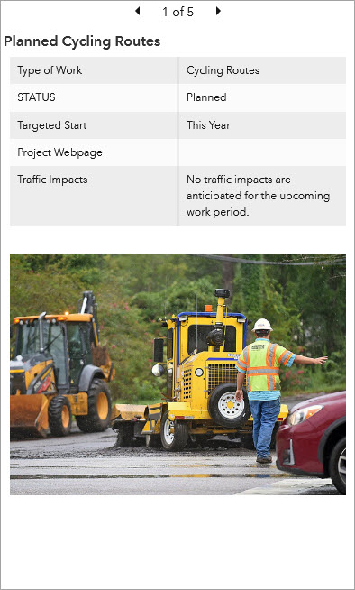
The details element is used to show information about features or rows from a layer. Its display is based on a layer's pop-up information. To configure the contents of the details element, you need to configure the pop-up.

As with all data-driven elements, you can create filters for the details element to limit the amount of information it displays. You can also limit the number of features displayed in the details element and sort the order in which features are presented. Filters can be useful to specify that rows with important values for a date-based field appear at the front of the element's carousel. This is particularly important in real-time scenarios.
Details options
On the Details tab of the configuration window, you can configure the details element to show the following parts of the pop-up:
- Title—Displays the pop-up title
- Contents—Displays the fields list, text, and Arcade expression in the pop-up
Note:
For an Arcade expression to be displayed, the data source for the details element must be an operational layer in a map. When a details element uses a map operational layer, deleting the associated map element also deletes the details element.
- Media—Displays images and charts in the pop-up
- Attachments—Displays the layer attachments
Note:
For attachments to display in the details element, the attachment display setting must be either Auto or Gallery in the pop-up configuration.
Actions
You can use details in interactive dashboards as the target of an action. This means that an action performed on another element, such as a selection on a list or a category selector, can control the data displayed on the details element.