A theme is a template framework representing the look and feel of an app. Contents in a theme include a collection of panels, styles, and layouts, and a set of preconfigured theme widgets. One app can include more than one theme, but it can only use one theme while running.
Web AppBuilder for ArcGIS provides out-of-the-box themes. The Theme tab supports the following functions:
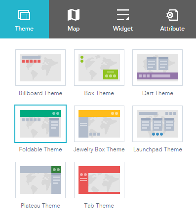
- Select a theme—Choose from one of the following themes.
- Billboard—This theme has the most layouts of all the themes and does not include a widget controller. All the widgets in the theme are on-screen widgets. It is designed for the app with simple tasks.
- Box—Focuses on the widgets in the widget controller. By default, all on-screen widgets are turned off. There are no placeholders. It is designed for the app that requires a clean look on the map.
- Dart—The widgets in the widget controller display like placeholder widgets. You can have multiple widgets open and move them around. By default, all on-screen widgets are turned off. There are no placeholders.
- Foldable—The first theme created by Web AppBuilder. It supports all widget types and can be used for the app with complicated tasks.
- Jewelry Box—Evolved from the Foldable theme with a focused widget on the left of the app. It is designed for the app with a workflow task.
- Launchpad—Designed for users who prefer the Apple Mac style. It allows you to open multiple widgets, and move, resize, and minimize them.
- Plateau—Can be used to create a modern and basic application with flat toolbars and widget containers.
- Tab—Like the Foldable theme, it supports all widget types and can be used for the app with complicated tasks.

Caution:
The Plateau theme is not available when you build 3D apps.
Currently, the following themes do not support Internet Explorer 8: Box, Dart, and Launchpad.
- Select a style—The available styles vary depending on which theme is selected. Most themes have eight colors to choose from, except the Launchpad theme.

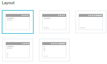
- Select a layout—A layout represents a preset placement of user interface items.

- When you build 2D apps, the available layouts vary depending on which theme is selected. In addition, there are two styles of layout. One is for desktop and one is for mobile devices. When either the height or width of a screen display is less than 600 pixels, the mobile layout applies.
- When you build 3D apps, each theme has two layouts for desktop only.