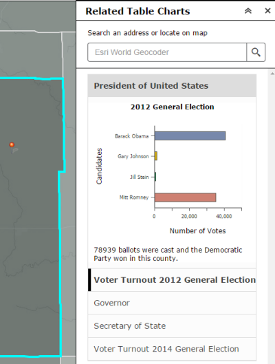
The Related Table Charts widget allows you to chart (bar, pie or polar chart) values from a related table of a feature layer.
The structure of the layers requires a relationship between a feature layer and a table and must be a one-to-many geodatabase relationship.
Configuring the Related Table Charts widget
The Related Table Charts widget can be set to open automatically when apps start. To do so, click the yellow dot on the widget to change it to green.
- Hover over the widget and click the small edit icon
 . The configuration window for this widget opens.
- Optionally click the Change widget icon button and replace it with your own image.
A file explorer window opens, allowing you to select a local image file to use as the widget icon.
- Click Add New to add new layers to the widget. When prompted, define the following parameters:
- Select layer—Define the layer to be configured in the widget. If you configure more than one layer, the layers are required to be the same geometry type.
- Select table related to layer—Define the related table of the defined layer.
- Optionally add additional layers to be configured in the widget by repeating the step above.
- Optionally, under the Chart settings table, change the order of layers in the widget by using the up and down arrows, or remove a configure layer by clicking the Delete button.
- Under the Settings tab, you can specify the following options:
- Section title—Define the section title, including field name variables.
- Chart title—Define the title of the chart, including field name variables.
- Description—Provide additional information about your chart, including field name variables.
- Chart type—Choose the type of chart to be displayed (bar chart, pie chart or polar chart).
- Data series field—Choose a numeric field value to be charted.
- Label field—Choose a field to label the charted values above.
- Chart color—Select one of the options below to style the chart.
- Single color—The chart will be the same color.
- Color by theme—The chart will use the different colors belonging to the theme.
- Color by field value—The chart will allow you to select an individual color for each bar chart or pie slice based on a field.
- X-axis title—Define the label for the x-axis of the bar chart (Bar chart only).
- Y-axis title—Define the label for the y-axis of the bar chart (Bar chart only).
- Optionally, under the Layout tab, you can see an outline of what the chart will look like for each layer.
- Optionally, in the General Settings section of the widget configuration, you can specify the following options:
- Graphic location symbol—Select and adjust the symbol of the address or location symbol.
- Refresh interval—Define the interval at which you would like the charts to refresh. This should be a value between 0.1 and 1,440 minutes.
Tip:
If you configured the widget for more than one layer, you'll want to optimize the visual appeal of the map by turning off all the configured layers in the map. By doing so, you won't have overlapping symbology and blending of colors in the application.
The first time you search an address or click on the map, you will see the first layer configured in the widget displayed in the related chart, and the corresponding layer will be turned on in the map. When you select another chart, the corresponding layer will be turned on and all other layers turned off.
Using the Related Table Charts widget
- Click the Related Table Charts widget icon to open it.
- Search for an address in the search bar or click a location directly on the map to execute a search.
When a defined location selects a layer, you see the chart information expanded in the widget panel.

- Optionally, if other layers have been configured, select the heading of each item and see additional charts. To collapse a chart, click the expanding heading again.
- Hover over the bar chart or pie chart to see the exact numeric value.