GeoPlanner dashboards display key performance indicator (KPI) information in easy-to-read gauges and charts so you can quickly visualize and understand the impacts of design decisions in real time. You can access the dashboard widget from many segments of the GeoPlanner workflow. The dashboard displays qualitative and quantitative information about your Active Scenario point, line, and polygon features. As you add, update, and delete features in your Active Scenario, the dashboard automatically updates to provide you with immediate feedback on the impacts of your design decisions.
The GeoPlanner dashboard allows you to track impacts across multiple KPIs so you can easily assess advantages and disadvantages while trying to balance multiple competing priorities for your design outcome. These KPIs can be represented as charts or gauges in the dashboard. Charts provide qualitative indicators of a plan's performance. Gauges provide a quantitative indication of a plan's performance. Once a collection of charts and gauges has been defined for measuring the performance of designs in a planning project, their configuration can be easily shared with other project team members as a way to standardize the parameters used for evaluating alternatives among the team.
You can configure multiple charts and gauges within a dashboard so that you can monitor several different KPIs. You can also share a dashboard with your project team members or the template from which a project was created. This helps standardize the KPIs used within a project or across any project created from a specific template. Sharing a dashboard saves time by simplifying configuration.
You can open the dashboard by clicking the dashboard button on the map toolbar.
There are two types of dashboard items: charts and gauges.
Charts
Charts help you understand the distribution of feature types within a dataset and, optionally, can be configured to show a qualitative indication of suitability for your plans. Each dashboard chart in GeoPlanner displays two graphics. The chart on the left, or primary chart, displays the distribution of unique feature types for the selected layer. The chart on the right, or secondary chart, displays a summary of features from an assessment layer or evaluation model that lie beneath those features highlighted in the primary chart.
The following graphic represents a dashboard chart that contains a primary chart of Active Scenario land-use polygon features and a secondary chart of an assessment layer of neighborhood home values. The yellow pie wedge represents residential features in this plan. The secondary chart summarizes the types of neighborhood home value features within those residential features.

Primary charts can help answer questions such as the following:
- How many hectares of residential land are in my design?
- What is the total length of highways in my transportation plan?
- How many wells are within an area?
Secondary charts show how Active Scenario layers overlay with an assessment or evaluation model layer. They can help answer questions such as the following:
- How much of my proposed residential land is within a 5-minute walk to a park?
- How much of my proposed highway expansion is within an area of low population density?
- How many of my wells are located within a 100-year flood plain of a river or stream?
Charts are dynamic. They update each time you create, modify, or delete features within your Active Scenario.
Assessment layers and evaluation models
Assessment or evaluation model layers help you understand the suitability of a development activity in an area. These layers increase your locational awareness so you can plan and design more effectively in a given geographic context. They are used in the secondary charts to display a relationship to the features in the primary chart.
Assessment layers are created using one of the following methods:
- Run an analysis tool from the Analysis drop-down in the Explore segment, and then reclassify the result layer using the classify function.
- Reclassify any feature layer using the classify function.
Evaluation models are the output from weighted raster overlay.
Gauges

Gauges help you understand the effect or outcome of your designs relative to a specific, calculated performance metric. Gauges allow you to define ranges and targets appropriate to each specific KPI you want to evaluate your plans against. The value presented at any given time in the gauge is calculated in real time using an equation consisting of feature type filters, feature attribute values, constants, and arithmetic operators that you define specific to your KPIs.
Gauges help you answer questions such as the following:
- What is the projected population of a housing development?
- What is the projected yield of a crop within an area?
- How many jobs could be created from a new commercial development?
Gauges are also dynamic. They update each time you create, modify, or delete features within your Active Scenario.
Selected features
You can now display dashboard metrics against selected features in scenario layers. This will help you focus your metrics on subsets of features. Use the following process to compute metrics against selected features:
- In GeoPlanner, display the dashboard by clicking on the Dashboard icon on the left side of the map.
- Click Design > Select Feature > Multi—Select.

- In the Multi-select dialog, click the Layer drop-down and select the scenario design layer in which you will select features.
- Click New set and Draw Rectangle.
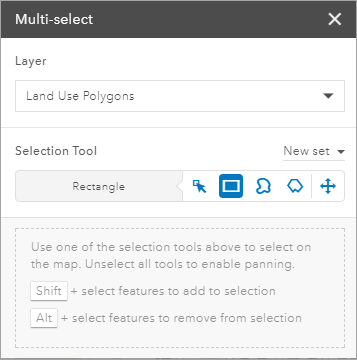
- On the map, draw a rectangle around the features you want to select.
Study Areas
Study areas represent planning sub—areas. Study areas help you focus on a specific location like a neighborhood or a watershed. When you activate a study area, the dashboard will compute metrics for scenario features within or that intersect that study area.
Maximize
The GeoPlanner Dashboard widget allows you to view a single chart or gauge item at a time, or you can view the entire dashboard simultaneously. Click the Maximize button in the upper right corner of the widget to increase the size of the Dashboard widget to the maximum allowed by your screen resolution so that you can view the values of many or all of your charts and gauges at once. Click the Restore button when in maximize mode to return the widget to its default size where a single chart or gauge is displayed.

Note:
When maximizing the dashboard, you will likely want to hide other widgets so that all charts and gauges can be easily seen without obstruction.
Dashboard Settings
You can specify how features are included in charts and gauges in the Dashboard Settings window. Click the Dashboard Options button  to access the Dashboard Settings window.

All Features
The All Features setting indicates that charts and gauges will compute against all features within a scenario. Charts will compute area, perimeter, length or counts for all features within a scenario. Gauge equations will execute against each feature within a scenario. This is the default setting for each new gauge that you create.
Reporting on All Features promotes a more thorough or accurate understanding of project performance because every scenario feature is included in a metric. Use All Features when you require a holistic view of your project metrics.
Visible Features
The Visible Features setting indicates that charts and gauges will compute against scenario features in the current extent. Charts will compute area, perimeter, length or counts for visible features only. Gauge equations will execute against each visible feature in GeoPlanner's current extent. This is the default setting for the design chart and each new chart that you create.
Reporting on Visible Features may be more performant because fewer features are included in a metric. Use Visible Features when you require high performance and need to understand a metric for only features visible on screen.
The Optimize Performance Slider
Dashboard Settings includes a performance slider that may improve the performance of dashboard computations. This slider controls how a feature is generalized when fetched from ArcGIS Online or your portal and included in a dashboard calculation. Generalization is the process of simplifying features for change of scale or resolution. The slider represents a maximum offset tolerance. Vertices within that tolerance are removed such that the features displayed in the map contain a subset of the original feature vertices.
When the slider is set to Accurate, no generalization occurs. Area, perimeter and length calculations in charts and gauges will be accurate. As you move the slider toward Speed, your features will be more generalized. This will reduce the accuracy of area, perimeter and length calculations in charts and gauges.
The following graphic shows generalization tolerance distances on the Optimize Performance slider. When the slider is set to Speed, generalization tolerance is 300m. Units are meters.
Note:
Consider moving the Optimize Performance slider to greater generalization tolerances when working at regional, national, or global scales.
Non–Design Layers
You can set non–design layers in the primary chart of the dashboard. These layers must be polygon feature layers with a unique value renderer. Dashboard charts configured with non-design layers in the primary chart will only report on visible features.