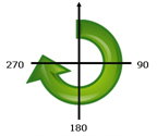
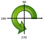
The map viewer allows you to explore your data in different ways through a variety of smart mapping styles. When you use Change Style in the map viewer, the nature of your data determines the styling suggestions you see by default. Once you have decided how you want to present your layer—for example, circles or colors to show population—you can make changes to its appearance that are immediately reflected on the map. The map viewer gives you control over graphic elements such as color ramps, line weights, transparency, and symbols.
Supported layer types
You can use Change Style with the following types of layers:
- Hosted feature layer
- CSV on the web
- CSV, SHP, GPX added to map
- ArcGIS Server feature layer
- ArcGIS Server map image layer that supports dynamic layers
- Individual feature layers from an ArcGIS Server map image layer
- ArcGIS Server image layer with vector field data (symbology changes only)
- ArcGIS Server stream service
- GeoRSS (Location (Single symbol) in single-layer GeoRSS layers only)
- OGC WFS layer (Location (Single symbol) only)
Note:
To change the style of a vector tile layer, follow the instructions in Update vector tile layer style.
General styling options
When you apply a style to your layer using the Change Style pane, you can change and rotate symbols as needed.
Change symbols
If you want to use different symbols in your layer, you can change all the symbols at once. The choices you see depends on the type of symbols you are using. To change symbols, do the following:
- Click Symbols.
- Do any of the following:
- For Shape, click a symbol set and click the symbol you want to use. For Location (Single symbol) and Counts and Amounts (Size), adjust the size of the shape, and if you want to use your own symbol, click Use an image, enter the URL of the image, and click the add button
 . For best results, use a square image (PNG, GIF, or JPEG) no greater than 120 pixels wide by 120 pixels high. Other sizes will be adjusted to fit.
 - For Fill, click a color and adjust the transparency. For Counts and Amounts (Color), click a color ramp and invert the ramp. This flips the colors.
- For Outline, click a color, change the transparency, and change the line width. For polygons, check the box to adjust outline automatically.
- For Shape, click a symbol set and click the symbol you want to use. For Location (Single symbol) and Counts and Amounts (Size), adjust the size of the shape, and if you want to use your own symbol, click Use an image, enter the URL of the image, and click the add button
Rotate symbols
Rotate symbols by an angle, determined by a chosen field, when you want the symbol to reflect direction—for example, the direction the wind is blowing or a vehicle is traveling.
To rotate symbols, do the following:
- Check the Rotate symbols (degrees) box.
- Do one of the following to set the rotation angle:
- To use an attribute, select the attribute you want.
- Beginning with 10.5.1, custom expressions written in the Arcade scripting language can also be used when setting the rotation angle. To use a custom Arcade expression that has been created for the layer, select it at the bottom of the drop-down menu. If you want to edit the expression or its name, click the Edit Expression button and use the editor window to edit it.
- If you want to create a new Arcade expression, select New Expression from the drop-down menu and use the editor window to create your expression, including giving it a name.
Arcade expressions are supported for all styles except Heat map, Predominant Category, Predominant Category & Size, and the Age styles.
Tip:
If you need help with any of the Arcade functions, click the Information button beside the function to see reference information about the function.
- Select one of the following:
Clockwise from 12 Angles are measured clockwise from the 12 o'clock position (geographic rotation).

Counterclockwise from 3 Angles are measured counterclockwise from the 3 o'clock position (arithmetic rotation).

Classification methods
If you style a layer using color or size to show numeric data, the layer is styled by default using a continuous color ramp (see Counts and Amounts (Color)) or a sequence of proportional symbols (see Counts and Amounts (Size)). You also have the option of classifying your data—that is, dividing it into classes, or groups—and defining the ranges and breaks for the classes. For example, you may want to group the ages of individuals into classes of ten (0-9, 10-19, 20-29, and so on). Classification lets you create a more generalized (less detailed) picture of your data to tell a specific story.
Depending on how much data you have in your layer, you can also choose the number of classes—one through ten. The more data you have, the more classes you can have. The way in which you define the class ranges and breaks—the high and low values that bracket each class—determines which features fall into each class and what the layer looks like. By changing the classes using different classification methods, you can create very different looking maps. Generally, the goal is to make sure features with similar values are in the same class.
Equal interval
Equal interval classification divides the range of attribute values into subranges of equal size. With this classification method, you specify the number of intervals (or subranges), and the data is divided automatically. For example, if you specify three classes for an attribute field whose values range from 0 to 300, three classes with ranges of 0–100, 101–200, and 201–300 are created.
Equal interval is best applied to familiar data ranges, such as percentages and temperature. This method emphasizes the amount of an attribute value relative to other values. For example, it could show that a store is part of the group of stores that make up the top one-third of all sales.
Natural breaks
Natural breaks (also known as Jenks Optimal) classes are based on natural groupings inherent in the data. Class breaks that best group similar values and that maximize the differences between classes—for example, tree height in a national forest—are identified. The features are divided into classes whose boundaries are set where there are relatively big differences in the data values.
Because natural breaks classification places clustered values in the same class, this method is good for mapping data values that are not evenly distributed.
Standard deviation
Standard deviation classification shows you how much a feature's attribute value varies from the mean. By emphasizing values above the mean and below the mean, standard deviation classification helps show which features are above or below an average value. Use this classification method when it is important to know how values relate to the mean, such as when looking at population density in a given area, or comparing foreclosure rates across the country. For greater detail in your map, you can change the class size from 1 standard deviation to .5 standard deviation.
Quantile
With quantile classification, each class contains an equal number of features—for example, 10 per class or 20 per class. There are no empty classes or classes with too few or too many values. Quantile classification is well suited to linearly (evenly) distributed data. If you need to have the same number of features or values in each class, use quantile classification.
Because features are grouped in equal numbers in each class, the resulting map can often be misleading. Similar features can be placed in adjacent classes, or features with widely different values can be put in the same class. You can minimize this distortion by increasing the number of classes.
Manual breaks
If you want to define your own classes, you can manually add class breaks and set class ranges that are appropriate for your data. Alternatively, you can start with one of the standard classification methods and make adjustments as needed. There may already be certain standards or guidelines for mapping your data—for example, an agency might use standard classes or breaks for all maps, such as the Fujita scale (F-scale) used to classify tornado strength. Place the breaks where you want or need them.
Styling considerations
- Imagery layers have a different workflow specific to changing the symbology.
- When you edit a feature layer in the map viewer, the map displays the symbology and templates configured by the layer owner. When you finish editing, the styles you set for your map will once again appear.
- The scene viewer does not support heat maps.
- Smart mapping is intended for use with the map viewer and configurable apps. Not all ArcGIS mapping and business apps support heat maps, counts and amounts when Classify Data is unchecked, or per-feature transparency. When styling maps targeted for an ArcGIS app, consider these limitations. For example, if your organization views maps in Explorer for ArcGIS, you could style income data using colors with natural breaks.
- If you save your style changes to a hosted feature layer item, you cannot use it to publish a hosted tile layer if the styling includes heat maps, counts and amounts when Classify Data is unchecked, multiple attributes, or per-feature transparency.
- For counts and amounts (color), the histogram that shows data distribution may not appear if the layer does not have sufficient data or it takes too long to retrieve the data.